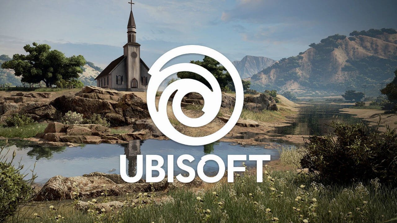
Ubisoft on their official blog, unveiled a new design for their iconic swirl, marking the games company’s longest time between updates since the iconic swirl in 2003.
Ubisoft first opened its door in 1986, with their first game, Zombi. Ubisoft took full advantage of being a company that opened in the 80s and made sure to design their first logo in a style that conformed to the bright and bold neon aesthetic that was prevalent in that era. Since then the company has changed their logo several times, with the first change in 1995, after the very first Rayman game had released. The second logo change wouldn’t be until 2003 after Ubisoft had acquired Red Storm and set out to create new Tom Clancy titles.

The 2003 logo was the longest kept branding for the company, with the 2017 change, the new logo keeps the iconic swirl and intensifies it with bolder line work and the removal of colour to really accentuate the thicker lines. On their official blog, Ubisoft has stated that their reasoning for the new look being transparent, is to fill it with colour and texture from all their future projects and games.


