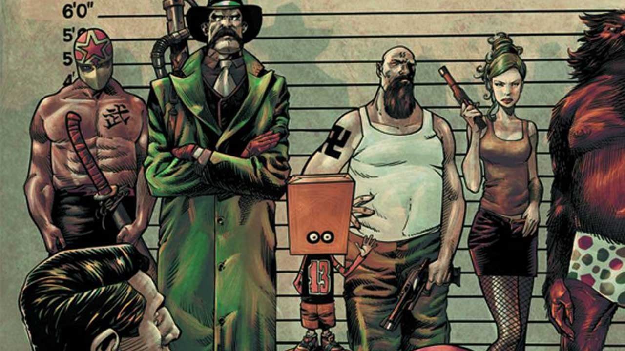
Over the past few years it has felt like Image has been experiencing a true renaissance, as they’ve been producing some extremely high-quality comics from both big, established names, as well as quality material from lesser known, newer names on the scene. It was with this state of mind that I picked up Todd: The Ugliest Kid on Earth #1, interested in trying out a new title, which has a limited commitment as it’s only a four-issue mini-series. The cover looked bizarre but had a certain charm to it, and I was interested in seeing what would come of it.
Sadly, I was completely let down by this issue. Actually, I should clarify that and say that I was let down by the writing of this issue. I found the script to be mean-spirited, and lacking completely in character. The main character, Todd, is a bit of a lovable loser, however everything that happens in this book is mean-spirited, and it just feels like too much by the end. Just imagine reading a Peanuts strip featuring Charlie Brown, and everyone ACTUALLY hating Charlie Brown, to the point where he has not one friend, and he is consistently and frequently dumped upon. This book takes it way too far, as the only person in town who does anything bordering on nice for the poor kid is a horrible child killer, who only spares Todd because he’s so ugly, and he only kills beautiful young children, as opposed to the ugly ones like Todd. I was intrigued by this book, partially because I often stay within the comfortable confines of superhero comics, and once in a while it’s nice to poke my head outside and try something else that doesn’t fit into a neat genre. But the only genre that seems to fit this comic is mean-spirited, depressing romp. By the end of the issue, I was kind of hoping that this was the one and only issue, like a one-shot, because I just don’t have any interest in ever reading the second issue, especially if it means reading more of the same.

Although I had numerous problems with the script, it’s the artwork which lifts the overall rating on this book up from being a 2 or 3 out of 10, and instead makes it a 5. The artwork needs to be on a different book, because it is totally mismatched with the tone and style of the script. The artwork looks like it would actually work in a Peanuts-type kind of book, with certain elegance in the artwork, as well as youthfulness. It captures the children that are featured in the narrative quite well; I just wish that the script would have called for less malicious behaviour.
I’m not planning on returning to this series for the second issue, but I can only hope and imagine that maybe, just maybe, this series will get better, and stop piling everything on the protagonist. It just rubbed me the wrong way, and felt bitter and depressing, and utterly lacking any humour. Humour would have made this book tolerable, yet the humour we DID get was mean-spirited, just like the rest of the script.


