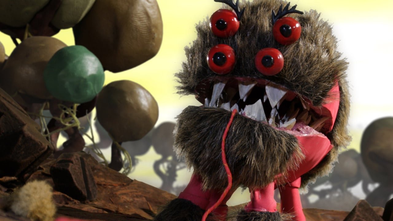
It’s no secret that a lot goes into the process of making a game. This industry is built on the perfect mix of art, tech and business to get people excited and engaged and invested in intellectual properties. On Wednesday, Pencil Test and Versus Evil gave a bit of insight on the creation of their upcoming title Armikrog, a point and click adventure about an alien and his companion who crashed on an unknown island. The trailer focused on the art style–claymation with stop motion effects—and the process of making it. Aside from showing the crazy amount of talent it takes to create something like that, it highlighted how insanely important art direction is to a game.

Style is the first thing a gamer notices. Before the game is even purchased, all a player really knows is what it looks like. That’s a huge selling point. The cover art, along with the few images on the back of a game case really show off what the title is about. If Batman: Arkham Knight was stylized like Kirby: And The Rainbow Curse, there would be a huge disconnect with the game and the core audience. Actually, the more I think of that the more it would probably be like Batman: The Brave and the Bold but with more colour and violence.
That doesn’t seem like the worst idea, the tone and the overall message would be a scattered mess. While a lot of different factors that go into creating tone, art style is probably the most important. Sega’s 2009 cult classic Mad World is a good example here. The game really doesn’t have a variety in colour. Instead, the fine men and women at Platinum Games went with black, white and red. It’s designed to look like a cliché violent graphic novel, and the gameplay follows suit.

Which is one reason why it’s spiritual successor Anarchy Reigns isn’t anywhere near as memorable. The black and white was replaced with a more realistic take, which didn’t fit the game, and everything suffered. It’s about capturing something unique, and memorable. That isn’t to say every game needs to be like Mad World. More realistic visuals worked well in conveying tone in The Legend of Zelda: Twilight Princess. One of my most fond memories of that game was looking across Hyrule Field at the castle that is surrounded in a magic pyramid. It was a not-so-subtle reminder of why you are on your quest. The game would not have felt as epic if the franchise kept to the cell shaded Wind Waker design. The message would be lost, and the scale would be tarnished.
Which is why Pencil Test’s trailer revealed so much about the game. It’s definitely unique with the use of stop motion and clay figures. Before Armikrog even launches, people know what to expect. The idea was to make cartoony point and click adventure, and the style they chose will make it memorable. And if the game isn’t that great, at least it will be unique.
Obviously, pretty graphics and unique art style aren’t the alpha and omega of any video game. But they are pretty important. If anything Armikrog’s behind the scenes trailer shows how much work goes into creating that. From complimenting the game’s core concept to conveying a specific message, or even as a selling point, the art direction of a game is crucial to its success.