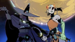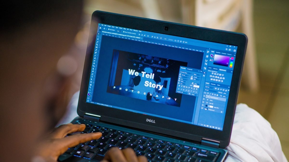
It can be assumed without a doubt that the idea of graphic design has evolved significantly since the time it first appeared. The term was coined by book designer and illustrator W. Dwiggins with the intent to describe his works like illustrations, lettering, typography, or calligraphy in printed mediums. Then the phrase developed to be used for the creation of visual materials like print advertisements, posters, and street signs. Nowadays, graphic design is perceived as something easily accessible due to the multiple choices of online editors like Vista Create, where card and album cover maker tools are available along with other design features.
Frankly speaking, graphic design has come a long way, but it is still developing. For that reason, plenty of major misconceptions and myths related to it constantly arise. Whether you are a pro-creator or non-designer, you may have heard some of them. This post debunks four of the most common myths. Intrigued? Go on reading!

Myth #1: Only Print Mediums Use Graphic Design
The first myth on our list is the idea that graphic design is used only for print mediums. However, the thing is that nowadays, it encompasses a broad range of digital mediums. Just look at a few examples of its usage:
- website banners;
- graphics on social media platforms;
- email newsletters, etc.
Graphic design is used closely cross with UX and the creation of different types of content for social media. For instance, covers, blog banners for Facebook or the arts, and email headers for the YouTube channel are made using graphic tools.
Myth #2: It Is All just about Picking the Right Font
Mastering the art of adding and properly arranging text messages is one of the key points that contribute to making beautiful creations. But here, things go far beyond just good font selection. The creator must think over many points:
- which font type better suits the company’s brand message;
- which typeface perfectly demonstrates business values;
- whether it is suitable for the target audience;
- the combination of fonts on the page, their size, text colour and boldness, and the spacing between letters;
- whether typography compliments the overall composition, etc.
For instance, the cursive typeface tends to complement brands with a classic style. The solid sans serif fonts are considered pretty modern options.
At the same time, there is more than just typography to consider when it comes to graphic design. The text must be added in a way that it will interact with other components on the page, including the following:
- graphics;
- images;
- lines;
- white space;
- shapes;
- framings, and so on.
All these details must work together in perfect synchronicity for the design composition to look powerful and impressive.

Myth #3: Effective Result Requires a Talent
It is a true fact that a lot of graphic designers possess a visual eye and a natural creative streak. This is the reason why they gravitate toward the design field so strongly. But that fact in no way proves that one must have the natural-born talent to master graphic design.
Contrary to popular opinion, graphic design is not always about holding a vision and magically bringing it to life. It is equally an art and a science. There are certain methods and techniques in this field, starting with being aware of the various components that make up a powerful and compelling design. Consequently, graphic design is one of the areas that simply requires thorough learning, practicing, and mastering skills to get the perfect result.
Myth #4: Main Objective Is to Make Things Pretty
Another big misconception about graphic design is that this is an art and it is just about making things look aesthetically pleasing or simply pretty. Nevertheless, this is not always the case.
The term “pretty” is very subjective. What one thinks looks fine may look chaotic, messy, or tacky to another. Moreover, the goal of graphic design isn’t always to make things look pretty. The apparent example is that while traditionally beautiful and neat compositions can work for women’s beauty brands, they cannot be applied to men’s hardware brands.
Design isn’t always about making people think that something looks pretty. Sometimes it’s about astonishing or even shocking the viewer, prompting their thought or evoking particular emotions.
In fact, there are a lot of misconceptions regarding graphic design that still arise in the world of designers and creators. However, these myths should be dispelled, and now you’ve just examined several of them.