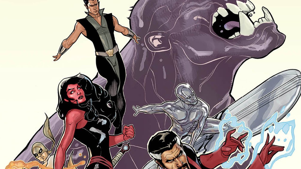

When this title – the most recent Defenders to be launched over the last few years – was first announced, I was pretty sure I was going to give it a pass. I’ve never really been a fan of the team, having grown up in the wrong era to be able to properly appreciate the concept. However, after reading the prelude story in Marvel’s Point One one-shot, I decided to give it a shot, as I was intrigued by how Fraction was writing Doctor Strange. This is a very off-beat comic, which is what one expects from the Defenders, but it works thanks to the unique characterizations that litter these pages. The tagline for the book is an apt one: “Protecting Humanity From The Impossible”, and Doctor Strange and his cohorts band together to do just that. However, Hulk isn’t on the team this time around, with his spot being filled by Red She-Hulk. Iron Fist is added to the roster as well, partially because he’s rich and has a jet that can get the team where they need to go (instead of having to use the Eurail, one of the funnier bits from this issue).
Although most of the issue is spent on gathering together the team, it does feel like there’s more going on these days than in most first issues, simply because we get a healthy dose of characterization for each member of the team. Fraction gives them all a unique viewpoint and voice, which is essential for making this issue as engrossing as it is. The threat – essentially a dark Hulk, the Breaker of Worlds – is on the loose, and it’s up to the unique powers and abilities of the Defenders to stop it, at any cost. The cliffhanger ending sees one member of the team in dire peril, as a foe from the Defenders’ past shows up to herald the arrival of the Breaker of Worlds. I’m interested to see how Fraction uses this character, especially considering the last time they made an appearance in the mainstream Marvel Universe just a few short years ago, as a supporting character in Cable & Deadpool.
The artwork by the Dodsons is everything one would expect from them artistically, both good and bad. At times, the linework is just sublime, with Dr. Strange in particular looking very scholarly; this is a great look for the character that is sometimes lost in illustration. However, there are some panels where characters look awkward, as the poses aren’t natural and make the characters look unnecessarily stiff.
There’s a lot of promise here , and what will make this title either work or fail is not necessarily in the action or even the villain, but in how Fraction makes the team work and how he explores their characterization.
Highly Recommended!