I can’t say that I was expecting too much from a promotional comic anthology. Particularly one that calls itself “The Epic Anthology inspired by the film”. The name roster is decently impressive, citing the various artists and writers and their work, and suggesting that this may, in fact, contain some gems.
This proved to be rather apt, with a weak and muddled first half giving way to an enjoyable second.
“Rise of the Olympians”, the first story in the “Gods” section, is orange. Everything is painted in a rich amber light, which occasionally makes details hard to read. The writing is pretty typical for a prologue – lots of exposition summarizing the general feel of the entire chapter.
“The Pride of Prometheus”, like all feel-good stories, starts off with a man gasping for help, tied to a rock with his stomach sliced open. It gets worse from there, so you can use your imaginations. The story is kind of lame – Prometheus lies to Zeus about killing humans for all of five minutes before brazenly admitting it, Zeus is openly threatening and indignant. I’m not sure why this needed to happen for them to go to war.
“Dungeon of the Damned” suffers from wildly inconsistent and weak art, and an utterly unengaging story. The gods wildly shift gears in their attitudes towards each other, casually dismissive and outright hostile one moment and friendly and chatty (and boring) the other.
“The Bow Bearer”, in turn, has art that does not suit the material. 30 Days of Night fans might crucify me, but Ben Templesmith just isn’t the right man to draw Hercules. He doesn’t look like the strongest man in Greek myth – he looks like a willowy teen trying to play the strongest man in Greek myth. The writing is decent; Ares accurately comes across as a dick, and Hercules and Cyclopses reactions are believable.
“The War of the Gods” is practically impossible to follow. Dark, hyper-detailed art obscures the action, and the combat itself isn’t that impressive – I can’t tell how Ares knocked the titan’s head off with the hammer, unless he hit it like you’d hit a ball with a pool cue. There are at least two panels where I have no idea what’s going on. The writing reads like a trailer. This is not a good thing.
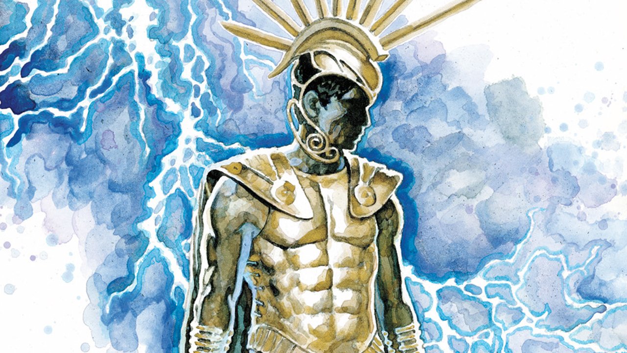
“Heroes” is a much stronger collection of stories. The best of the batch is Brian Clevinger’s “The Age of Hyperion”. It’s a well-told story, if fairly archetypal, of Hyperion’s fall from grace and rise to challenge the gods. It plays off as a typical evil overlord trying to recruit his enemy, which works fine throughout. The art is simple and effective, with enough detail to properly express.
“The Law of Zeus” suffers a bit from overcapitalization, with every few words of Zeus’ monologue coming across as him yelling. The art’s not much to write on the forums about.
“The Old Man’s Warning” is an entertaining story of young Theseus’ training, and his attempts to apply that training to a group of bandits eager to ambush his mother. The combat is interesting, the dialogue isn’t bad (far lighter than the other stories), and Theseus reliably acts like a precocious youth warrior. Phil Hestor’s art is a clean-but-angular style that suits the simpler action well.
“The Origin of the Beast” is so over-the-top is works. The Minotaur looks like Nathan Explosion after training for Mr. Universe – apt, as the entire story plays out like a heavy metal song. The colours are dark but clear, there’s a lot of expressiveness in the eyes and face to best portray fear and bloodlust. The writing and story are fine, considering its portraying two utter, monstrous assholes being pretty much that. It’s far more enjoyable brutality than “The Pride of Prometheus”, and for better-considered reasons.
“The Hunt”, the last story, has little to tell. It’s almost entirely devoid of dialogue, focusing more the family’s reactions and the Minotaur’s pursuit. It feels rushed, with some nice, starkly contrasting colour. It’s like a fragment, and that hurts it.
It’s a shiny package, in which the sparkles get in your eyes and make it hard to see, but not hard enough to see when the expository dialogue is silly (or when it’s not bad).