

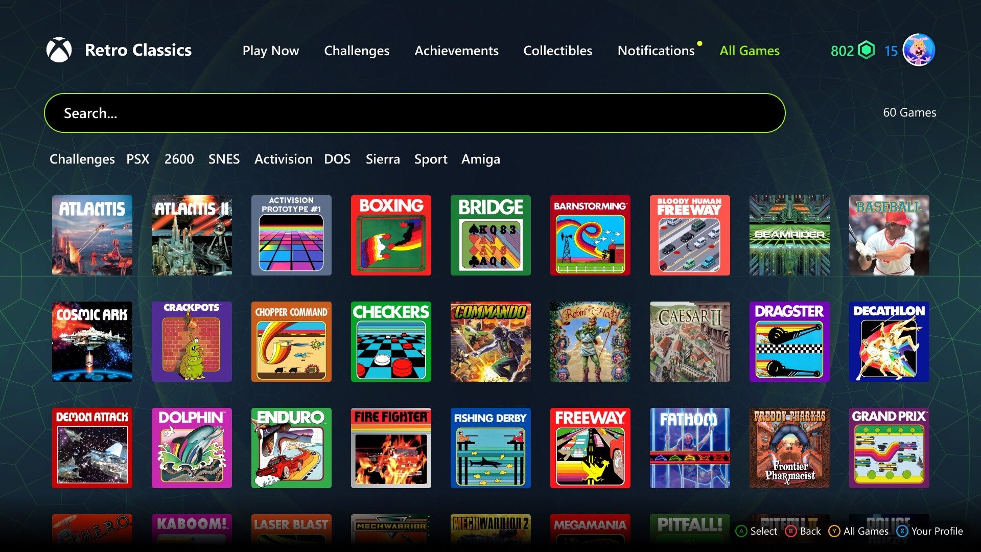
Digital entertainment keeps expanding, yet bigger libraries don’t automatically create better experiences. A modern game aggregator can connect broad content collections, but access is only the starting point. Players still need clear paths toward titles matching their mood, available time, preferred mechanics, and device. That makes game discovery a serious design challenge for modern platforms.
Why can a packed game library still feel strangely empty? The problem rarely involves limited choice; it usually involves weak presentation. When every title receives equal visual weight, browsing becomes tiring surprisingly quickly. Smart platforms reduce that friction through thoughtful categories, responsive search, and recommendations that feel helpful rather than pushy.
Bigger Gaming Libraries Need Smarter Navigation
Large gaming libraries can feel exciting during the first few visits. Here’s the catch: broader catalogues can also make choosing harder. Familiar thumbnails soon begin blending together, while lesser-known releases disappear below endless rows. A well-structured game aggregator solves part of this problem by organizing content consistently. However, interface choices determine whether that structure actually helps players find something worthwhile.
You don’t need flashy tricks or an overloaded homepage to have good navigation. It needs labels that match the way people naturally describe their interests. There are people who might want a quick puzzle, or a story-heavy adventure, or something relaxing after work. Those intentions matter more than internal product categories, which often only make sense to platform teams.
The best discovery systems tend to be built by combining a number of simple elements rather than trying to find one magical feature. Each element is devoted to a different browsing habit: the purposeful searcher, the casual wanderer. Together they build a library that feels curated, not constraining. These are four practical foundations that help you navigate large collections more easily:
- Use familiar genres, themes, and session lengths as visible browsing shortcuts.
- Keep search forgiving when users misspell titles or remember partial names.
- Refresh recommendations without constantly replacing trusted favourites and recent choices.
- Show meaningful previews before asking users to open another product page.
These ideas sound obvious, yet execution separates smooth platforms from frustrating ones. Search results must load quickly, filters must remain understandable, and previews should answer basic questions immediately. Players shouldn’t need several clicks to learn whether a title supports mobile play, short sessions, or particular interaction styles. Every unnecessary step weakens curiosity and interrupts the browsing rhythm.

Personalization Should Feel Helpful, Not Nosy
Personalization works best when users barely notice the machinery behind it. Relevant suggestions can shorten browsing, surface hidden gems, and revive forgotten favourites. Still, recommendation systems shouldn’t trap players inside narrow patterns too easily. A person enjoying strategy games today may want something entirely different tomorrow, so good systems always leave room for surprise.
That balance requires more than simply tracking a user’s recent clicks. Platforms should consider session length, device type, saved favourites, and deliberate searches, although context can shift without warning. A rushed mobile session feels different from a relaxed evening on a larger screen. Recommendations need flexibility, or they quickly start feeling stale and oddly repetitive.
Transparency also matters, especially when algorithms shape most visible choices. Simple explanations such as “because you played” can make suggestions feel understandable. Users should also control their history, hide irrelevant recommendations, and reset preferences easily. Those options should remain visible without friction or deeply buried settings. Such practical controls build user trust while improving future recommendation results.
Promotional Play Is Becoming a Product Experience
Promotional formats now sit closer to mainstream digital entertainment than many people realize. Teams evaluating sweepstakes casino games software face familiar product questions around onboarding, navigation, rewards, and mobile usability. The technology may serve a specialized model, but the experience still competes with polished games, streaming apps, and social platforms.
That competition changes expectations across digital products and every connected touchpoint. Consumers anticipate easy registration, clear regulations, user-friendly interfaces, and always-clear incentives. They also notice awkward transitions immediately, especially when interfaces suddenly change. When a promotion sends people through unrelated screens or unclear steps, excitement disappears. The best experiences make participation feel like a natural platform feature.
Platform Technology Should Stay Behind the Curtain
Most players don’t care how many integrations support a gaming library. They care whether pages load, sessions continue, and controls behave predictably. A capable game aggregator should therefore remain largely invisible to ordinary users. Its value appears through consistent metadata, stable performance, simpler content updates, and fewer jarring differences between titles from separate sources.
Mobile performance deserves particular attention because smaller screens expose every weak decision. There’s no escaping crowded menus, tiny controls and oversized banners. “Platforms need to focus on readable layouts, light paths, and lightweight previews.” A clean mobile experience isn’t simply a reduced version of desktop design; it’s a reimagining of what players actually need during short sessions.
Accessibility should be baked into the same conversation, not tucked away in a forgotten compliance checklist. Clear contrast, scalable text, keyboard support, and understandable labels improve experiences for everyone. These features also make complex libraries easier to navigate for diverse audiences. When discovery tools work across different needs and devices, platforms reach wider audiences without making the experience feel generic.
Conclusion: Better Game Discovery Builds Stronger Digital Worlds
The future of digital entertainment won’t depend only on adding more titles. It will depend on helping people understand, explore, and enjoy what already exists. Better game discovery turns an intimidating catalogue into a welcoming space. It gives familiar favourites room to breathe while creating genuine opportunities for unexpected discoveries.
At the end of the day, technology should be making it easier to pick a game, not harder. Solid navigation. Flexible personalization. Accessible design. Robust platform infrastructure. All of these things enable that goal. When those pieces come together, it means less scrolling and more playing. It is an easy thing to get results, but a surprisingly difficult thing to do well.